I redesigned my homepage with Claude Fable 5.2. Before and after
One sentence of brief. The dashboard in my hero became a deck of seven real product screenshots, and the numbers moved into one band. Before and after screenshots, the four things that broke and what it cost in bytes.
 Aimantas · Product builderUpdated 11 Nov
- Visitors
- 17 Last 24 hours
- Revenue
- — Not split by project yet
The short version
- The old hero was a dashboard about my products. The new one shows the products: seven real homepage screenshots stacked as a deck you can click, swipe or leave to cycle.
- The week's visitors and revenue used to repeat two and three times in one screen. Each now appears once, in a band with the chart at full width.
- Four bugs only showed up in screenshots, not in the build checks. The page is 17 KB heavier before compression. It went live on 11 November.
One sentence of brief, one homepage
My homepage led with a dashboard about my products. The products themselves were seven tiny logos. I rebuilt the first screen with Claude Fable 5.2 in Claude Code, and this is the before and after.
The brief from a human here was one sentence: redesign and improve the homepage, and make it show what Fable 5.2 can do. No mockup, no list of sections.
I didn't want a tech demo bolted onto a blog. A homepage that shows off a model and hides the work would be worse than the one I had. So I set one rule before touching anything: every new thing on the page has to be made of something real. Real screenshots, real numbers, the same copy.
Where it started
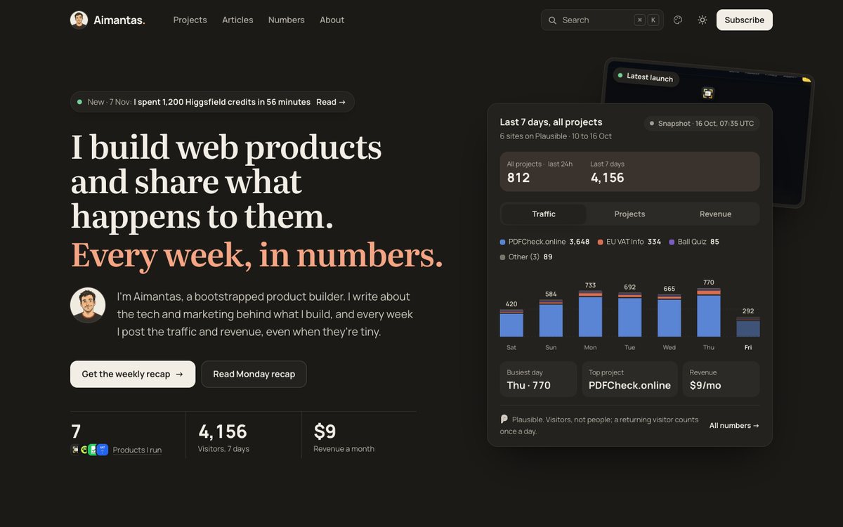
It wasn't a bad page. The headline was clear and the numbers were real. But when I read it as a stranger, three things bothered me.
- The numbers repeated. Visitors for the week sat under the buttons and again in the dashboard. Revenue was there three times: under the buttons, in the card's footer and behind a tab.
- The products were invisible. I say "I build web products" and then show a chart. The only product screenshot was half hidden behind the dashboard, and only for the newest launch.
- The chart was cramped. Seven days of stacked bars lived in a 448 pixel wide box next to a headline that had room to spare.
What changed
The hero now shows the products. The numbers moved into one band under it, and each one appears once.
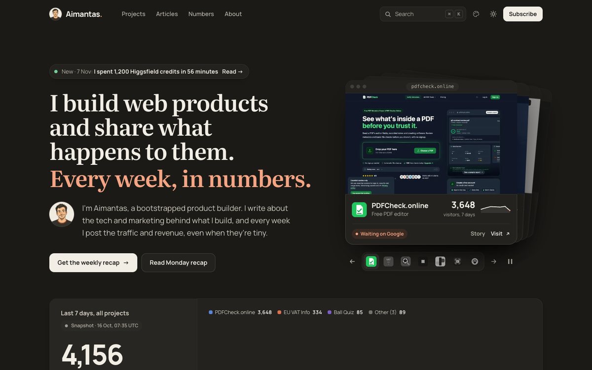
Before
- A dashboard in the hero, one screenshot behind it
- Week's visitors shown twice, revenue three times
- Chart in a 448 pixel card
- Products as seven 24 pixel logos
After
- Seven homepage screenshots as a deck of cards
- Each number once, in one band
- Chart as wide as the space it gets
- Each product with its name, status and its own visitors
I kept the headline, the introduction, the buttons, the colours and the type exactly as they were. A human signed off that copy over several rounds, and nothing in the brief said the words were the problem. Everything below the band, from the articles down, is untouched.
The deck
Seven products, seven real homepage captures, stacked like cards. The front one links to the live product.
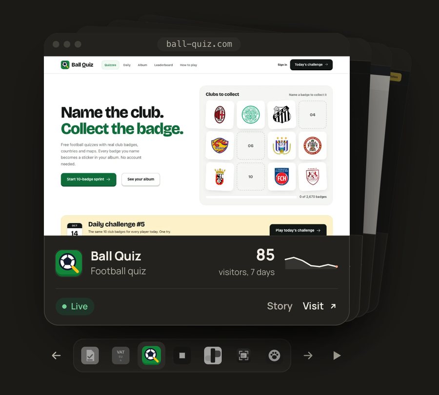
Here's what it does:
- It moves to the next product every six seconds. A thin line under the active logo shows the time left.
- The front card gets tossed to the back, and the rest step forward with a small spring.
- It holds while your pointer is over it or you've tabbed into it, and there's a pause button.
- The front card tilts a few degrees toward the mouse. Arrow keys and swipes work too.
- The visitor number on each card updates from the same live feed as the rest of the site.
The part I like most is small. Products are sorted by visitors, so the deck opens on whatever is actually doing best this week. Right now that's PDFCheck.online. If Ball Quiz overtakes it, the homepage changes without me.
The script is 142 lines with no library: 6.8 KB, 2.4 KB compressed. Without JavaScript the stack still shows the top product. With reduced motion turned on there's no timer, no toss and no tilt, and the pause button isn't shown because nothing moves.
One band of numbers
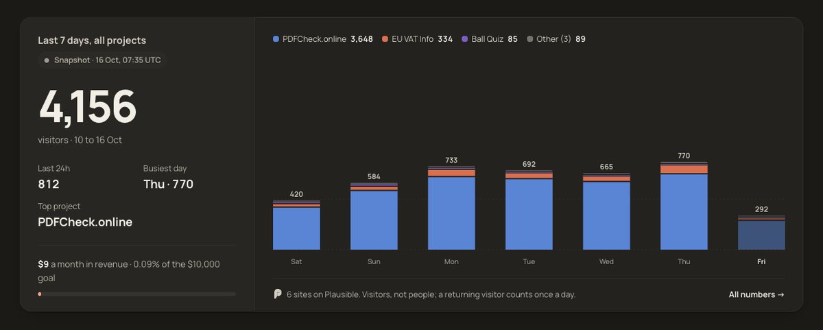
The old dashboard had three tabs. Traffic was the chart. Projects was a list that the leaderboard further down already shows in more detail. Revenue was one number and a progress bar.
So the tabs went. The chart got the width, the week's total got big type, and revenue became one honest line: $9 a month, 0.09% of the goal. I didn't write a new chart. The band uses the same hooks as the old dashboard, so the live feed fills it with no changes to the Worker.
On a phone
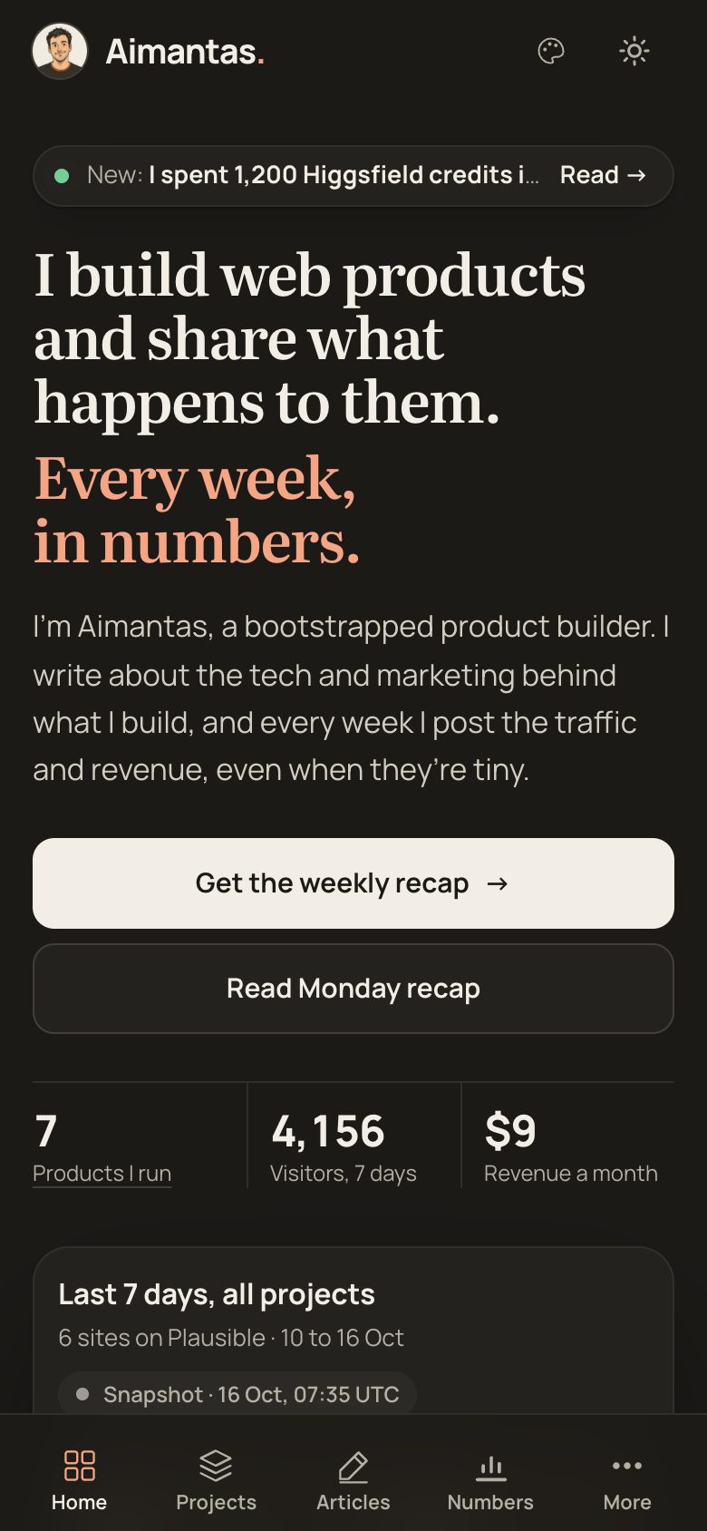
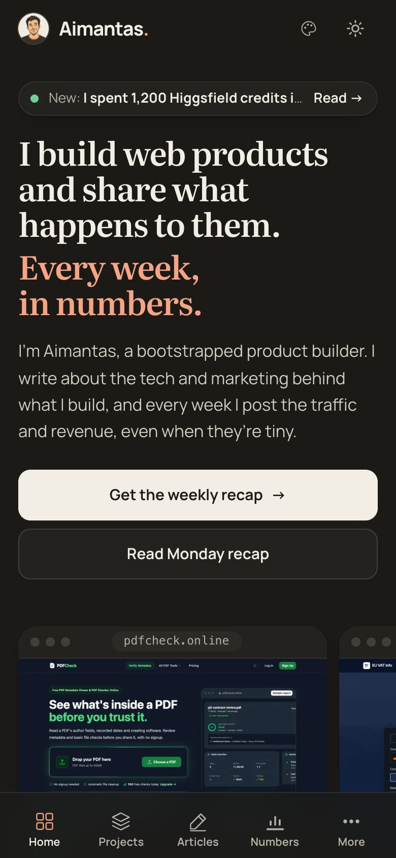
Both at 390 by 844 pixels, local builds with the same data, 10 Nov.
A stack of tilted cards is a bad idea at 390 pixels. On phones the deck becomes a plain row you swipe, using the browser's own scroll snapping. The edge of the next card shows, which is the oldest hint there is that something scrolls.
What broke on the way
Four things went wrong. Each one only showed up in a screenshot.
- The chart labels stretched. The chart code drew into a fixed 448 by 140 box and let the browser scale it. In a wide card the day names came out squashed. Now it measures the space it has and draws at that size.
- The headline grew a line. My first deck was 520 pixels wide. That pushed "Every week, in numbers." onto two lines and the headline to five. At 480 it's back to four.
- 4,156 read as "4, 1 56". Fixed-width digits and tight letter spacing don't mix at 68 pixels. I dropped the fixed-width digits on that one number.
- A screenshot showed three cards at once. I thought the shuffle was stuck halfway. It wasn't. Full-page capture in headless Chrome had blended two frames. A plain viewport capture showed the deck resting where it should. I added a timer fallback for the cleanup anyway, since a throttled tab can skip the event it relied on.
Light mode and the team colours
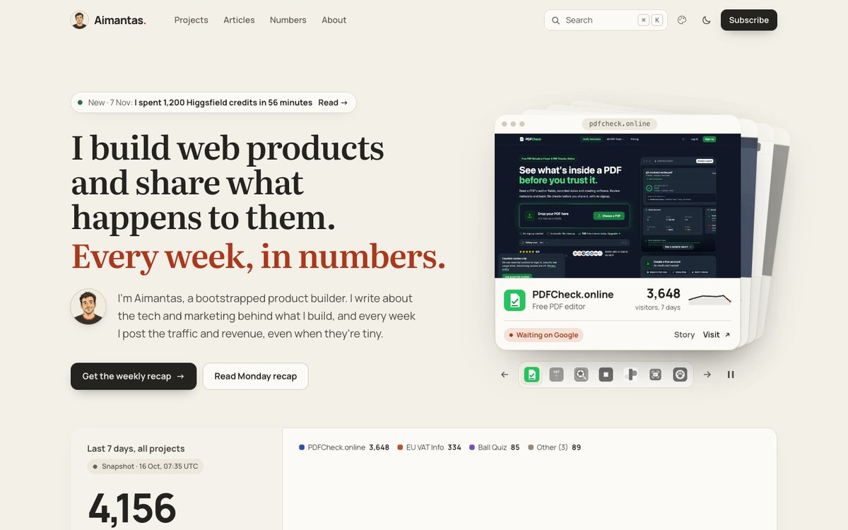
This site has a light and a dark mode and seven colour schemes. The new parts use only the existing design tokens, so they follow all of them. I checked the default scheme in both modes. I haven't opened the other six yet.
What I'd say about Fable 5.2
The useful part was the reading it did before it wrote anything.
Worked
It read the page builder and the design rules first, then reused the live data hooks. The new band needed eight changed lines in the site script, not a second chart.
Broke
Every visual bug above passed the build checks. None of them was visible in code. Without rendering the page and looking, I'd have shipped stretched labels.
Decide first
What stays. I kept the copy and the brand and changed the structure. A looser brief than mine would get a different site, and maybe not yours.
The whole change is four files I edited by hand: the page builder, the stylesheet, the site script and the new deck script. About 200 lines added to the first three, and the 142 line script.
What happens next
A human looked at the local build and said to ship it. The new homepage went live on 11 November.
It still needs opening in Safari and Firefox, a read with a screen reader and a look at the other six colour schemes. Then the question is simple: do more people click through to a product from the homepage than did from the dashboard? I'll have that number in two weeks, and I'll post it either way.
Where it stands 11 November 2026
Done
- Hero rebuilt as a product deck, numbers merged into one band (10 November)
- Checked in Chrome at 1440 and 390 pixels, light and dark, and with reduced motion
- Deployed to aimantas.com on 11 November; home page, this article and the live numbers checked in production
Not done
- Not opened in Safari or Firefox, not read with a screen reader
- Six of the seven colour schemes not checked
- No load time or click data
Next
I compare homepage clicks through to products for the two weeks before and after 11 November, and post the number either way.
Sources6 references
- Brief, 10 November 2026: redesign and improve the homepage to showcase Fable 5.2's capabilities, and write a post with before and after images. Run with Claude Fable 5.2 in Claude Code. Tokens and time not recorded.
- Hand-edited files: tools/build_pages.py (104 lines added), assets/site.css (106 added), assets/site.js (8 added) and the new assets/home.js (142 lines, 6,768 bytes, 2,409 bytes gzipped). Headline, introduction, buttons, palette and type unchanged; sections from the articles down unchanged.
- Built home page HTML: 213,887 bytes before (42,857 gzipped), 231,255 bytes after (45,650 gzipped). Above the articles, the 7-day visitor total appeared 2 times before and 1 after; monthly revenue 3 times before and 1 after; product homepage screenshots 1 before and 7 after.
- Screenshots: Chrome 1440 × 900 and 390 × 844 pixels through device emulation, 10 November 2026. Before images are a local build of the previous commit, after images a local build of the new one, both with the same 16 October metrics snapshot, so the numbers match. The live site overlays current figures.
- Checks run: the site build's own checks (links, share images, drafts, structured data, private markers, JS syntax); the deck's next, previous, jump and pause controls; reduced motion (no timer, no toss, pause button hidden); no horizontal overflow at 390 pixels.
- Deployed 11 November 2026 after a human said to. Checked in production: the home page matches the build byte for byte, the deck shows seven products, /api/metrics answers in live mode, and this article and its images load.
Keep reading
All 14 articles →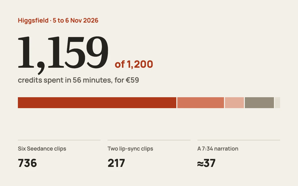
Older
I spent 1,200 Higgsfield credits in 56 minutes. An honest review
€59 bought 1,200 Higgsfield credits. Six 1080p video clips took 62.6% of them in under an hour. Here's the full breakdown, what it bought, and what I'd do differently.
7 November 2026Read →
More on aimantas.com
Hi, I'm Aimantas. This is my build journal.
A short intro: who I am, the goal I'm chasing and what you'll find here.
12 October 2026Read →
Related
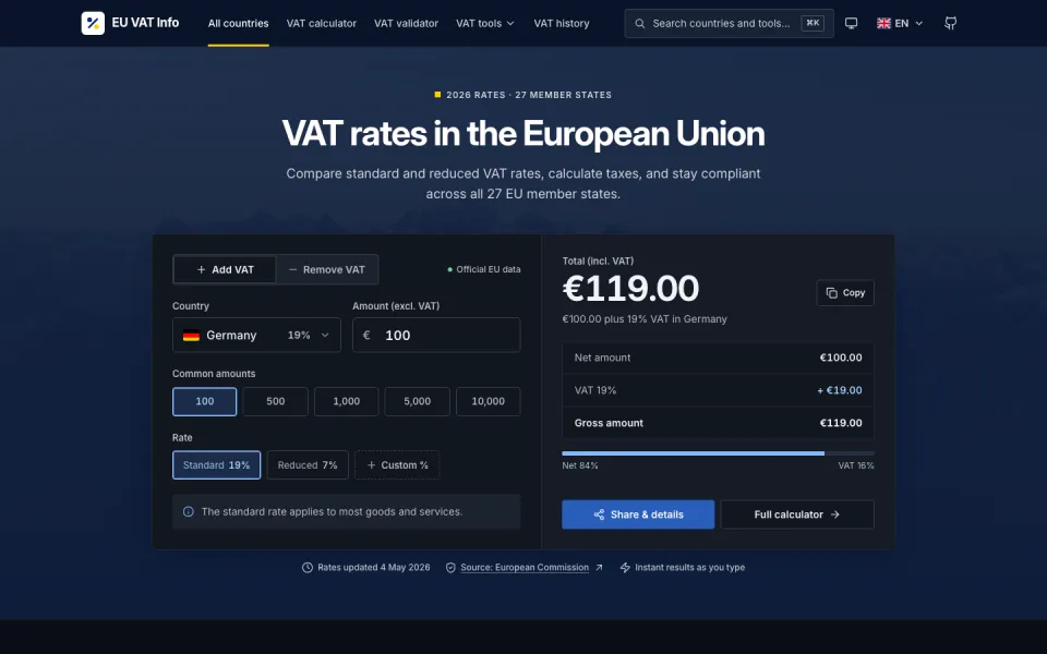
Drop 08: One design skill, three AI models, the same VAT site
I ran the Hallmark v2 design skill on EU VAT Info three times from the same commit: Claude Opus 5.5 in Claude Code, and GPT-6 Sol and GPT-6 Astra in Codex. What it does, what each model built, and what its linter missed without a browser.
23 October 2026Read →