Opus 5.5 built three of my sites. Fable 5.2 redesigned them
Three sites Opus 5.5 built, one Fable 5.2 session each. A quiz hero became the first question, a geography game got a whole learning loop, and a PDF tool page took two human nudges to get bolder.
 Aimantas · Product builder
The short version
- Fable 5.2 was best at reading a working product and finding the change that matters: Ball Quiz's hero became a playable question, and World Survey got lessons, spaced review and 395 new pages for search.
- It kept the visual design Opus 5.5 had made on both. On PDFCheck.online, where the look was the whole brief, it took four passes and two human nudges to get a modest step up.
- Ball Quiz and World Survey changes are live. The PDFCheck.online redesign runs locally only. One session per site, not a benchmark.
Three sites, two models
Claude Opus 5.5 built three of my sites over the last six weeks. On 10 November I gave each one to Claude Fable 5.2 with a short brief and one session. Here's what came back.
Ball Quiz, PDFCheck.online and World Survey were mostly written with Opus 5.5 in Claude Code. They're real products with real visitors, a design system each and weeks of human feedback baked in. That makes them a fair test of one thing: can a newer model look at a working product and make it better?
The briefs were short. "Make a better version of this" for Ball Quiz. "Run a redesign job so we can explore your design capabilities" for PDFCheck.online. "Create an improved SEO, engagement and UX optimised version of this game" for World Survey. Each run had the same design skills loaded that Opus had used before.
Opus 5.5 built
- Ball Quiz, including a full redesign on 24 October
- Most of PDFCheck.online, from September to late October
- World Survey v1 in one session on 3 and 4 November
Fable 5.2 changed
- Ball Quiz home: live on ball-quiz.com
- World Survey v2: live since 11 November
- PDFCheck.online home: runs locally, not shipped
Ball Quiz: the hero became the game
The old home page promised a quiz. The new one is the first question.
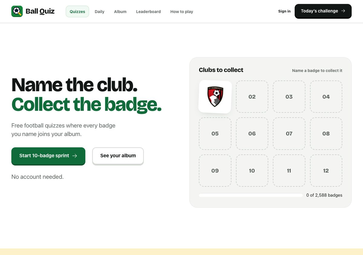
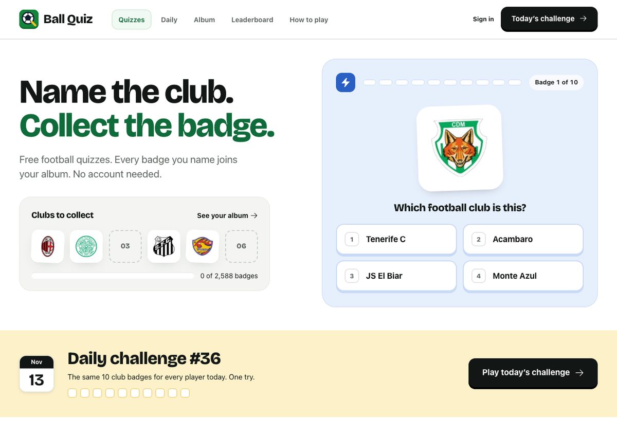
Before, getting to a question took a button, a setup screen and then the question. Fable read the product notes, decided that the fastest path to the fun was the thing to fix, and put a live question in the hero.
The part I didn't expect was the engineering under it. A home page that shows four answers could easily leak the right one in the HTML. Fable kept the answer on the server. The page only gets the choices and a one-time token, and a reused or expired token just starts a normal round. It wrote 11 tests for that.
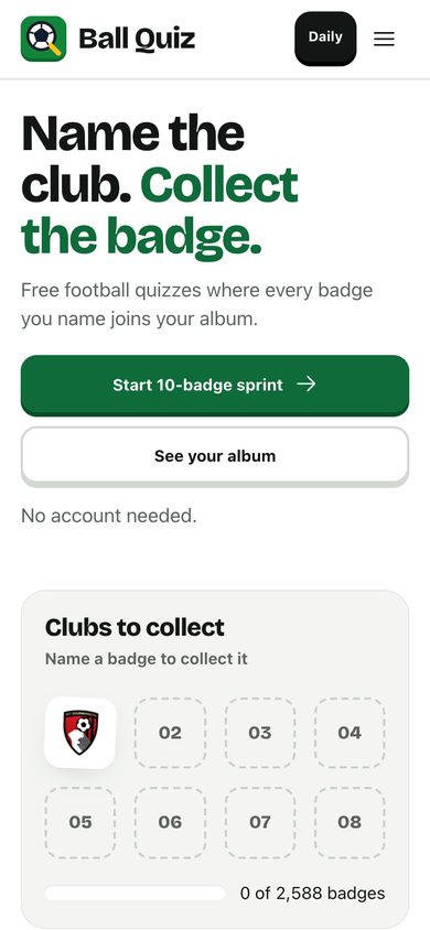
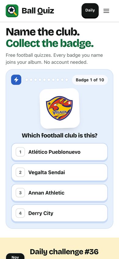
Both at 375 by 812 pixels from local builds with the same local database, so the badges are obscure clubs. On production a first visit gets a famous one.
It took 28 minutes from the brief to a checked local build, and the change merged as one pull request: 16 files, 525 lines added. The visual language didn't change at all. Same type, same green, same card shapes.
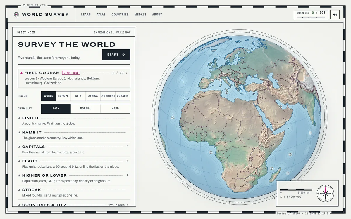
World Survey: same look, a whole learning loop
Fable didn't touch the design Opus made. It built the reason to come back.
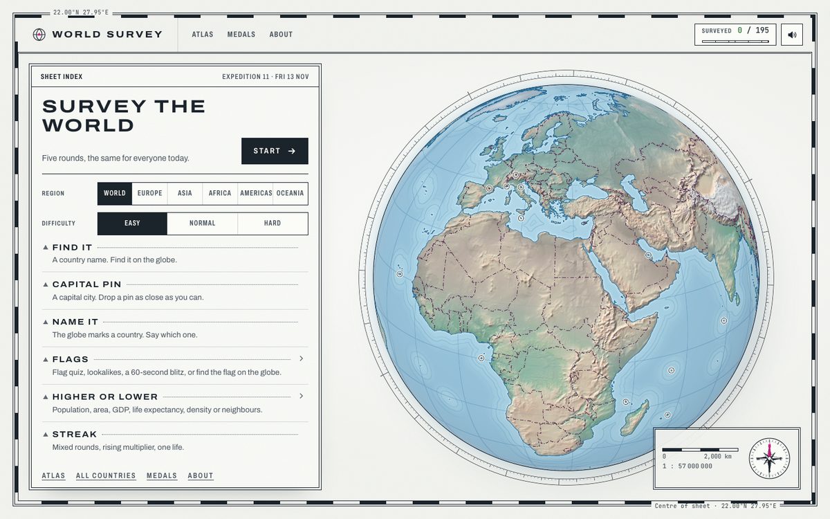
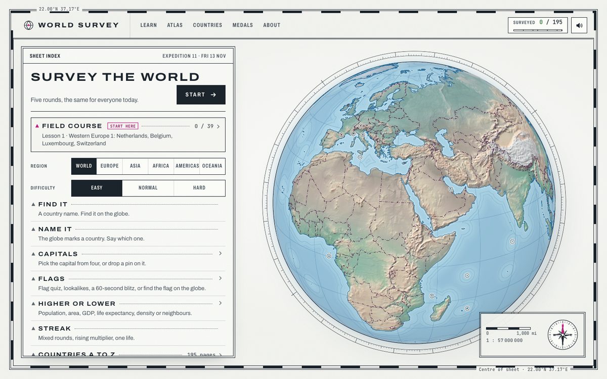
The relief globe, the paper sheet, the stamped type and the compass are all from the Opus session. I'd call that look the best visual work in this whole comparison, and Fable seems to have agreed. It left it alone.
What it added was a way to actually learn the map:
- A field course: 195 countries in 39 lessons of neighbouring countries, each with study cards and a quiz.
- Spaced review. Countries you miss come back after a day, three days and two weeks.
- Challenge links that replay the same countries and answer options, with your score to beat. No server needed.
- A capital quiz, a miles switch, offline play after one visit and screen reader announcements.
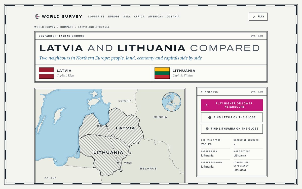
Then the search side: 12 ranked list pages, 314 comparison pages, 1,363 questions and answers across the country pages, and pre-rendered lesson pages. The sitemap went from 223 URLs to 618. The visible source grew from about 14,800 lines to about 19,700.
It built that in about 65 minutes, with two background builders doing the search pages while it worked on the game. It went live on 11 November.
PDFCheck.online: four passes and two nudges
This is the one run where the visual design was the whole brief, and the first two passes weren't good enough.
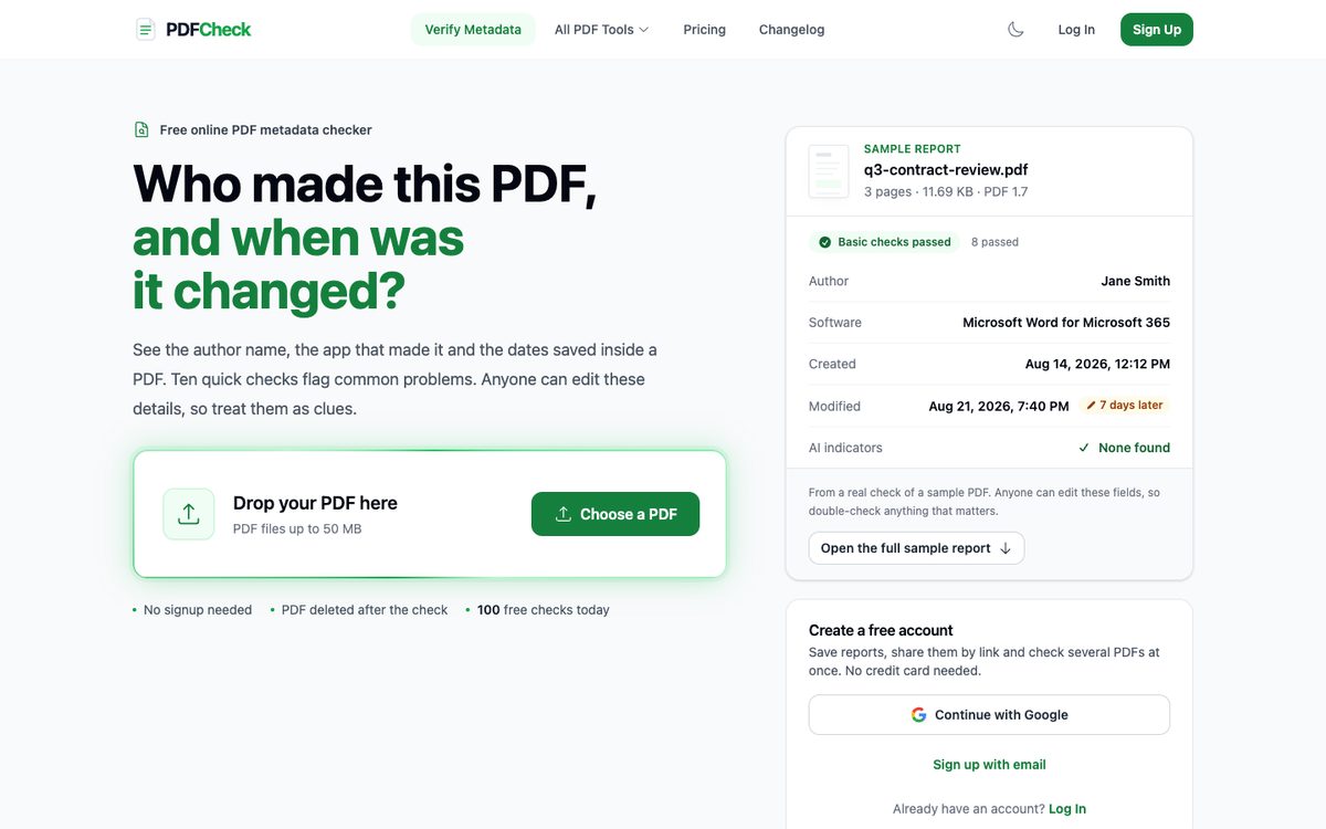
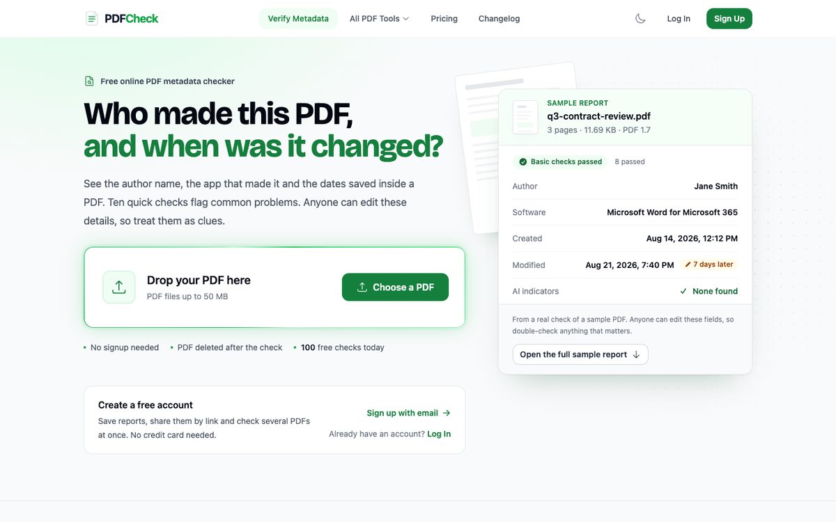
The first pass centred everything over a green field. It was clean and it looked like a thousand other SaaS pages. The human running this asked for a bolder direction. The second pass went back to a split layout and tightened the headline, and the answer was blunt: it looks poor.
The third pass is the one in the screenshot. A display typeface, Bricolage Grotesque, for the homepage headings. A PDF page tilted behind the sample report, so the right side reads as file in, report out. The report's fields arrive one at a time on load, and stay still with reduced motion turned on. The fourth pass carried the style down the page.
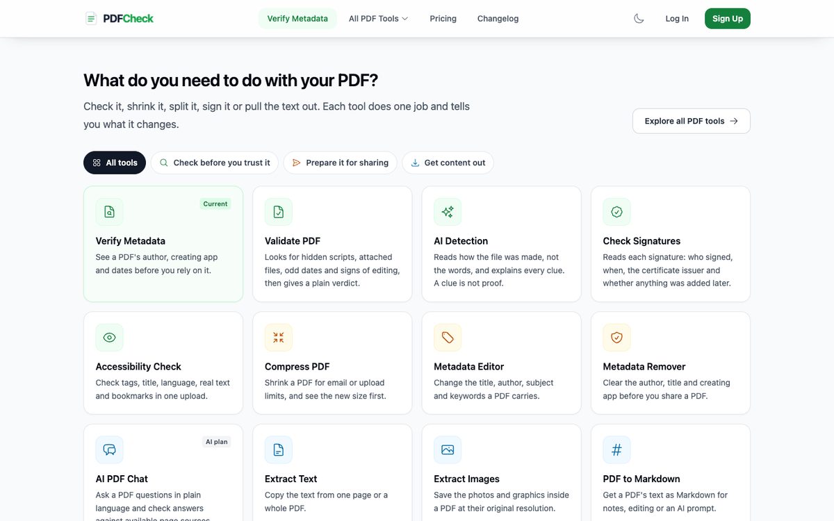
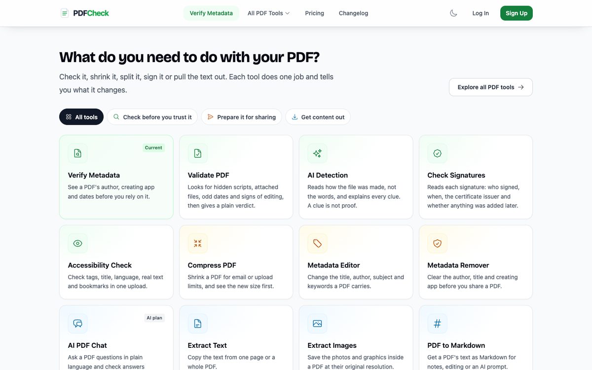
It's better. It's also an evolution of what Opus built, and I'm not sure a visitor would notice the difference. 8 files, 229 lines added. The changes only apply to the home page, so the 26 tool pages that share the grid are untouched.
Two honest caveats. This run used medium effort while the other two used extra high, so it isn't a level comparison even inside Fable. And it isn't shipped. It runs on my machine and nobody has decided whether to keep it.
So which one is the better designer?
From these three runs, I can't say Fable has the better eye. I can say it reads a product better.
Where Fable 5.2 was better
Finding the change that matters. It turned a promise into a playable question and a quiz into a course. Under each one it did careful work: a server-side answer token, spaced review, 815 pages that pass their own checks, and an honest count of 258 test failures that were already there before it started.
Where Opus 5.5 holds up
Making something look like itself from nothing. World Survey's atlas style came out of one Opus session, and Fable chose to keep all of it. Ball Quiz's look is from an Opus redesign too, and Fable kept that as well.
Where Fable fell short
Pure visual redesign of a mature page. PDFCheck.online needed two human nudges before it moved past safe, and the result is a modest step. World Survey's new pages weren't linked well enough until a human asked.
What I'd do with it
Give Fable the "make this better" jobs on things that already work. Give it a visual direction, not just "redesign it". Run it at the higher effort. And look at the result yourself, because both models report what they checked, and neither can tell you if it looks good.
What happens next
The fair version of this test is the same brief, on the same page, run by both models at the same effort, with the screenshots judged blind. I'll run that on one page and post the result whichever way it goes.
The PDFCheck.online redesign waits for a decision. If it ships, I'll compare uploads from the home page for two weeks before and after.
Where it stands 13 November 2026
Done
- Ball Quiz playable home merged and live on ball-quiz.com (checked 13 November)
- World Survey v2 live since 11 November
- PDFCheck.online home redesign built and checked locally at desktop and phone sizes (10 November)
- Article published on aimantas.com, 13 November
Not done
- PDFCheck.online redesign not committed or deployed; no decision yet
- No tokens, cost or controlled same-brief run recorded
- No before and after engagement numbers for any of the three
Next
I run one brief on one page with both models at the same effort, judge the screenshots blind, and post the result either way.
Sources7 references
- Model attribution: commit trailers in each repository. Ball Quiz commits from 28 September to 3 November name Claude Opus 5.5; the 10 November home change names Claude Fable 5.2. PDFCheck.online commits from 24 September to 29 October mostly name Opus 5.5, with 28 naming Fable 5.1 on 15 and 16 October, one naming Sonnet 5.5 and some naming no model. World Survey v1 was built in one Claude Code session on Opus 5.5 on 3 and 4 November; v2 in the same session on Fable 5.2 from 10 November.
- Fable 5.2 runs, all 10 November 2026 in Claude Code, times in UTC: Ball Quiz at extra high effort (brief 21:03, checked local build 21:31, pull request 21:45); PDFCheck.online at medium effort (20:59 to 21:47, four passes, with the human replies 'Try bolder direction' after pass one and 'looks poor' after pass two); World Survey at extra high effort (brief 21:04, locally verified build 22:09, deployed 11 November). Tokens and cost not recorded.
- Ball Quiz change: one pull request, 16 files, 525 lines added and 39 removed, including 11 new tests for the home opener. The full suite had 258 failures before the change and the same set after, all in older news, AMP and pipeline tests. Live check on 13 November: ball-quiz.com serves the opener markup.
- World Survey change: 243 files, 5,378 lines added and 286 removed between the 4 November and 11 November commits. Hand-written source (JavaScript, CSS, HTML, Python, excluding vendored code and tiles) about 14,800 lines before and 19,700 after. Sitemap 223 URLs before, 618 after (619 after the 12 November site map page). 12 list pages, 314 comparison pages, 1,363 questions and answers. The build's verifier passed 815 pages with unique titles and descriptions.
- World Survey linking fix: on 12 November a human noted that country pages took too many clicks to reach; an HTML site map and direct links to 195 countries were deployed the same day.
- PDFCheck.online change: 8 files, 229 lines added and 50 removed, uncommitted in a local worktree. Adds Bricolage Grotesque as a self-hosted heading face for the home page only.
- Screenshots taken 13 November 2026 in headless Chrome, light mode, at 1280 × 900 (Ball Quiz), 1440 × 900 (others) and 375 × 812 phone. Ball Quiz before and after are local builds of the commits either side of the change, sharing one local database. World Survey before is a local build of the 4 November commit; after is the live site, which reads US English as miles. PDFCheck.online before is the live site; after is the local redesign, with the cookie notice hidden in both and an announcement bar that is no longer live cropped from the top of the after image.
Keep reading
All 20 articles →
Newer
PDFCheck for iPhone is live: 8 hours in the queue, 26 minutes of App Store review
My first iPhone app went from submit to approved in 8 hours 33 minutes, on the first try. The exact status timings, what I gave the reviewer, the month it sat before submission, and the checklist I'd reuse.
14 November 2026Read →
Older
I built a 3D geography game with 618 pages. Here's how they fit together
A free geography game on a 3D relief globe, with country pages, lists and neighbour comparisons built from the same data. How the 618 pages are organised, what I set up for search, how it's meant to look, and the linking mistake I fixed the day after launch.
13 November 2026Read →
Related
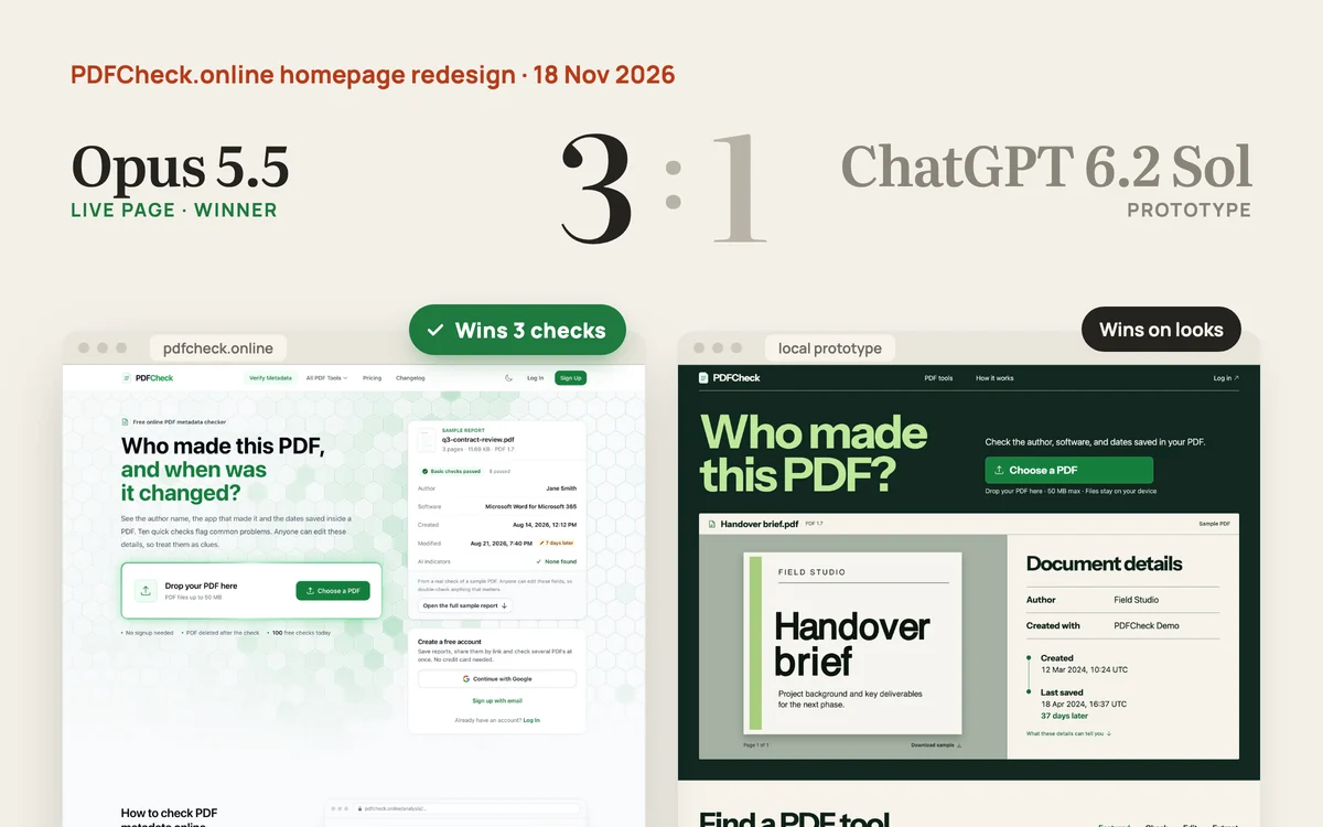
Opus 5.5 vs ChatGPT 6.2 Sol: Opus wins the PDFCheck redesign
6.2 Sol made the better-looking homepage in about 35 minutes. It also changed what the product promises and cut most of the page, so Opus 5.5 wins 3 to 1. Astra is next on the same scorecard.
18 November 2026Read →